ISLY just got a face lift(!!) and I'm really excited about the changes.
Back in October I blogged about
some design work that I did for
Florida-based photographer, Jemma. It was in that post that I mentioned that it was an absolute dream installing the graphics with the theme she purchased. In fact, I was jealous of how easy it was to implement graphics & customization. It wasn't that long before that, that I had launched a new theme & design on my own blog; a redesign that took nearly 3 months to "perfect".

Last month in an evening of frustration over how my blog looked, I contacted
ProPhoto to see if they'd let me review their theme. I squealed when they sent it to me in exchange for this review & I am here to tell you that
I am in love with it. It is, hands down, the best theme I've ever worked with. I'm no wordpress theme aficionado, but I
have worked with the popular Thesis & Canvas themes (you know, the ones that cost monies). Lemme tell you, ProPhoto is leagues better than both of those.
Here's why. . .
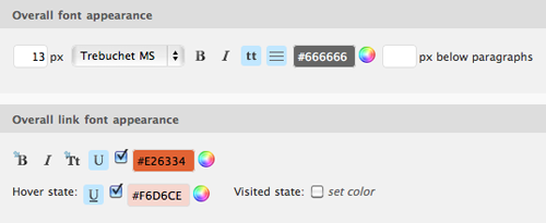
1. Prophoto is one of those click-of-a-button themes. It doesn't just allow you to put in a drop shadow here & a repeat image there. Oh no. It allows you to adjust pixels, kerning, leading, text case, drop shadows, direction & distance of drop shadows, background images for the menu, comments, background, etc. Really, it's super easy.

In fact, I didn't even
start this current redesign until about a week & a half ago. I designed as I went along & the process for adding & manipulating graphics was so slick I had most of the site fleshed out in a matter of an hour or two. Most of my time was spent deciding how I wanted to design the whole thing. It's so hard to design for yourself.
2. Prophoto is clean. The back-end is easy to navigate & the different
stock designs are clean. No crappy clutter of 6 different fonts blaring at you, making your eyes bleed.
3. Prophoto has a community. Once I installed the theme, there was a step by step tutorial taking me through the features of the theme. PLUS there's a little button at the top right of every element that takes you to specific articles & tutorials on how to best customize that area. If that's not enough? You can post your questions to the forum where expert contributors can help you figure things out. I had a question that was answered within an hour of posting to the forum. Super sweet.
While redesigning I had a list of the features that I would like in any updates of the theme, and as I got closer to finishing the layout, I crossed off practically everything on my list. They have thought of everything from Prophoto-specific widgets (like regular wordpress widgets, just on acid) to slick slideshows. The only thing I see missing is the fact that there are no settings for viewing on a mobile device. I'd LOVE to see that in any future updates.
This theme isn't cheap. It's $199. If you're serious about low-maintenance themes & want a one that's beautiful, easy to use & manipulate this is it. It's so good, even a cheapskate like me would invest the money to buy it.
Do you blog? Do you use wordpress? I'd love to hear what kind of theme you're using & what you think about it.
A big Thank you to Prophoto 3 for providing me with this theme. I'm in love.  Last month in an evening of frustration over how my blog looked, I contacted ProPhoto to see if they'd let me review their theme. I squealed when they sent it to me in exchange for this review & I am here to tell you that I am in love with it. It is, hands down, the best theme I've ever worked with. I'm no wordpress theme aficionado, but I have worked with the popular Thesis & Canvas themes (you know, the ones that cost monies). Lemme tell you, ProPhoto is leagues better than both of those.
Here's why. . .
1. Prophoto is one of those click-of-a-button themes. It doesn't just allow you to put in a drop shadow here & a repeat image there. Oh no. It allows you to adjust pixels, kerning, leading, text case, drop shadows, direction & distance of drop shadows, background images for the menu, comments, background, etc. Really, it's super easy.
 In fact, I didn't even start this current redesign until about a week & a half ago. I designed as I went along & the process for adding & manipulating graphics was so slick I had most of the site fleshed out in a matter of an hour or two. Most of my time was spent deciding how I wanted to design the whole thing. It's so hard to design for yourself.
2. Prophoto is clean. The back-end is easy to navigate & the different stock designs are clean. No crappy clutter of 6 different fonts blaring at you, making your eyes bleed.
3. Prophoto has a community. Once I installed the theme, there was a step by step tutorial taking me through the features of the theme. PLUS there's a little button at the top right of every element that takes you to specific articles & tutorials on how to best customize that area. If that's not enough? You can post your questions to the forum where expert contributors can help you figure things out. I had a question that was answered within an hour of posting to the forum. Super sweet.
While redesigning I had a list of the features that I would like in any updates of the theme, and as I got closer to finishing the layout, I crossed off practically everything on my list. They have thought of everything from Prophoto-specific widgets (like regular wordpress widgets, just on acid) to slick slideshows. The only thing I see missing is the fact that there are no settings for viewing on a mobile device. I'd LOVE to see that in any future updates.
This theme isn't cheap. It's $199. If you're serious about low-maintenance themes & want a one that's beautiful, easy to use & manipulate this is it. It's so good, even a cheapskate like me would invest the money to buy it.
Do you blog? Do you use wordpress? I'd love to hear what kind of theme you're using & what you think about it.
A big Thank you to Prophoto 3 for providing me with this theme. I'm in love.