Some of you may have noticed the ALT button on my sidebar the last few months. It's a cool-looking button, eh? Well, I'm proudly going to be attending the
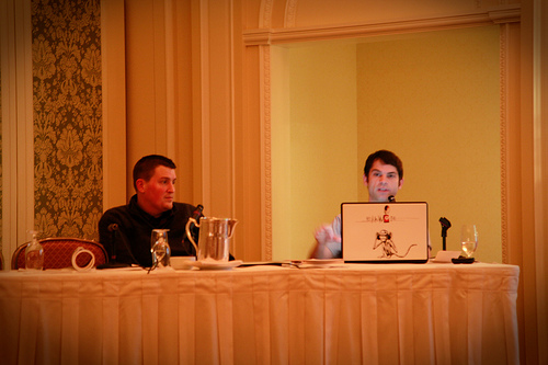
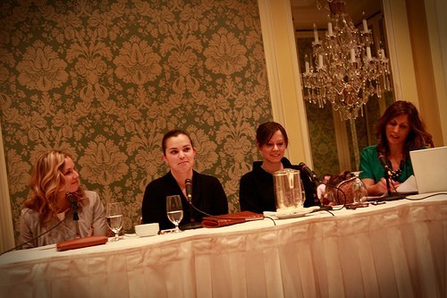
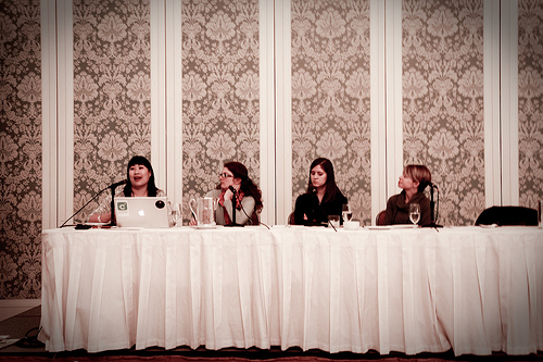
Altitude Design Summit this weekend, and I couldn't be more excited.
The speakers are going to be out-of-this-world awesome and the activities are going to be glam-fabulous.
I'm super excited.
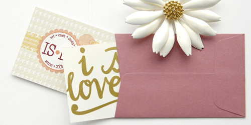
In preparation for the conference, I needed to print more business cards. Of course it wasn't going to be a simple re-print of the cards I gave out at BlogHer. Oh no. I need to redesign my site, cards & everything. It kind of snowballed into this huge thing. As you can see the site hasn't changed, yet. Lame. I've been a little busy getting the business cards perfected.
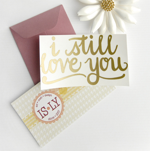
Didn't they turn out beautifully? I bought some small envelopes a while back, and decided I'd use that to package the business card. I also designed a die-cut vinyl sticker that says "i still love you" in my own handwriting to stuff in the envelope. They're gold. You really need to see them in person to really appreciate it, but they're beautiful. It's so funny how a printer can make or break your day.
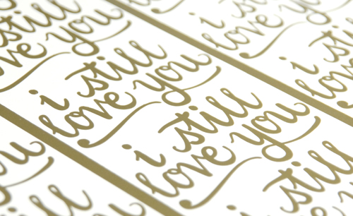
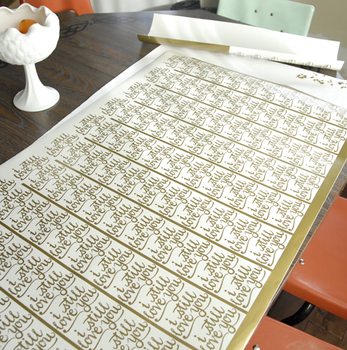
The printer who did the stickers for me gave me a good deal, so long as I weeded and cut them myself. Weeding is when you peel out the negative space of the die-cut sticker, which is time-consuming and unusually fun. The weeding was a piece of cake, and so was the cutting. . . well, until about 11pm last night when my rotary cutter slipped and took a turn for the worse.
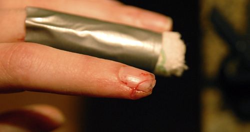
You want to know how sharp brand-new rotary cutter blades are? Effing sharp. It went clean through my nail and through part of the pad of my finger. It even took out part of my middle finger. It was a good thing Chris was around to help. Penelope wouldn't be much help in a situation like this. Gross, hu?
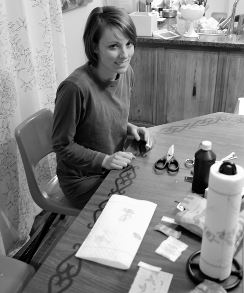
I was thinking about giving myself a manicure for ALT, but this was clearly not the one I had in mind. Chris so kindly scoured the entire Salt Lake valley for steri strips and got me some old fashioned liquorice to bite down on for the pain. Man that hurt. He's thoughtful, isn't he? Besides the minor set-back of having my index finger out of commission, things are moving right along in preparation for ALT. I can't wait for tomorrow!!
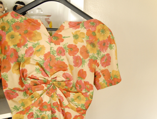
Tomorrow night is a 1920s social and I have the perfect dress for the occasion. It's orange (awesome, right?) it's real hand-dyed silk, it's from the '50s and it was my grandmother's. I love it. Are you going to ALT? Are you excited, too?!?
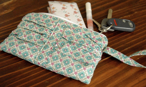
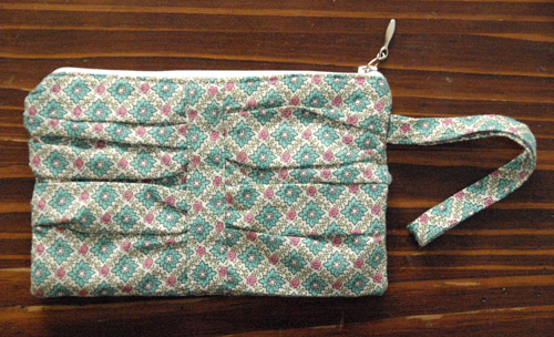
 Now that I finally have a nice phone, I've got to protect it from Penelope. I was planning on going to TJ Maxx or Ross to get a cover (because that's where you go for cheap iphone covers), but Penelope napped for nearly four hours yesterday! Four hours was plenty of time to design and create my own case – and make a tutorial to share with you! I'm just tickled about how it turned out. I just love the pink/orange color combo.

 This was a very easy project. If you have all of the materials ready, it would surely take less an hour to make (embellishing not included). Did I tell you that I love my finished product? It's fabulous, and I'd surely make it again. I wouldn't change anything about the pattern, but I would like to try using elastic instead of a small leather strip across the front. That might make tucking the flap away, a tad easier. OH, and did I mention that I LOVE how it turned out? EEE! I'm so happy about it.
Well, I hope you give this tutorial a try. If you do, please share pictures! I've just started a flickr group and I would love to see you join! Enjoy!! This tutorial (click above to dowload) is free for personal use only.



 I love spritz cookies. I have very fond memories of my mom making a million of these little cookies in assorted Christmas colors and in the cutest, petite shapes. They're incredibly addicting and easy to make. I can't tell you the excitement I felt when my mom gave me a cookie press for Christmas. There may have been an audible squeal. These cookies are divine when dipped in chocolate, topped with a melt-in-your-mouth lemon icing or just by themselves. Without any further Ado, here's the recipe:



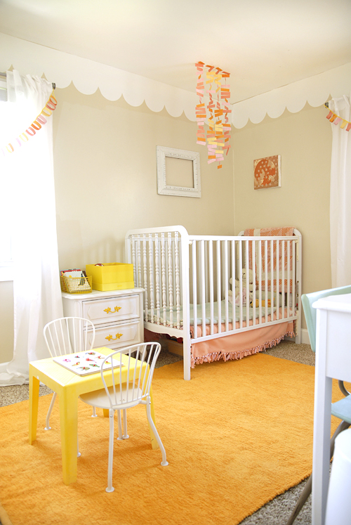
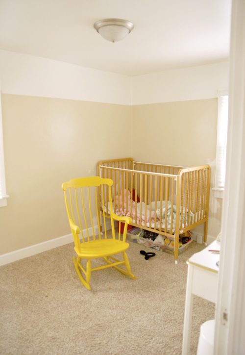

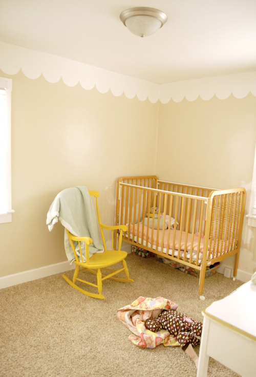
 Penelope's room is starting to look better, but I've got a long way to go. Something needs to be done about her bare walls! I've got a few ideas up my sleeve. You'll be seeing more of her room as I get them done.
