Archive for the ‘tutorials’ Category

3 Rookie Mistakes with Brush Lettering

2 Comments

I came out with a book! This Penmanship book takes you through the progression from all-caps print, to cursive, to developing your style to brush lettering. It’s a modern penmanship approach that uses foundations of Romans, Italic, Business Penmanship and Engrosser’s Script. Sounds like a hodgepodge, but it totally makes sense. Click here to snag a copy! 

Hello new friends from Studio 5! Check me out on Instagram to peek at all the fun stuff going on…

You can progress through the book in chronological order, or skip around as you see fit. The book is loose-leaf pages with a 3-hole punch so you can put it in any 3-ring binder and pull out pages for practice with tracing paper. We opted for this as opposed to a spiral bound book, because we wanted this to be approachable for both right-handed and left-handed beginners! The book is geared towards any beginner ages 10+. Ages 6-10 can work on it with grown up guidance.

So let’s talk about the 3 common mistakes that I see in beginners approaching penmanship AND brush lettering and how to fix it…

Mistake 1: Holding the pen wrong and too tightly

Hold the pen or marker (check out my line of brush markers right here!) in a traditional tripod grasp. Don’t let your thumb take over! And if you’re having a hard time with holding the pen too tightly, hold a pen or object in your non-writing hand as tightly as you can. Your grip in your writing hand will naturally ease up.

Mistake 2:  Going too fast

99% of my beginner students write too quickly. I’m constantly saying slow down. Slowing down will give you better structural precision until muscle memory takes over, and it allows for better and more controlled transitions from thick to thin when doing brush lettering. GO SLOW. Then, GO SLOWER. Slow, purposeful practice is going to get you better, faster. 


Mistake 3: Practicing willy nilly

Use those guide sheets!! I have multiple blank guide sheets and practice worksheets for each letter I teach in my book. Practicing with guides makes all the difference in bringing muscle memory into learning. With all 3 of these tips combined, you’ll be unstoppable! 

Hope you enjoyed my segment on Studio5! Let me know if you have questions about my book. And if you’re the kinda person that needs to learn face-to-face… I’m teaching a beginning brush lettering workshop next week, September 19th. Click here to register. And as always, my online class is always open.

TUTORIAL: Visual Journaling at Church

0 Comments

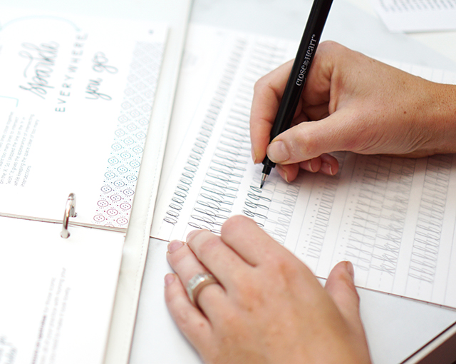
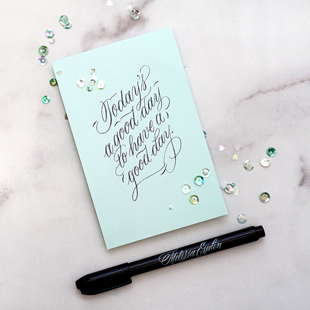
I teach calligraphy and lettering over at Calligraphy.org, and would absolutely love to teach you the lettering aspect of journaling. I have a very, very beginning fundamentals class for hand-lettering right here. The hand-lettering fundamentals will show you how to push beyond just stick capital letters and lowercase letters to add dimension to your work. I also teach a brush lettering class, it’s geared toward complete beginners and I personally walk you through manipulating the brush/marker to create beautiful work in your own style. Use code SUNDAYNOTES for 10% off through April 30, 2019

I’m so excited you’re here! Here’s a resource to the supplies I use. I used some affiliate links here. By purchasing through my affiliates your price isn’t changed, but you help support my art habit. ;) I’m linking to the sites I shop that carries each item at the lowest price. 

MY JOURNALS: 

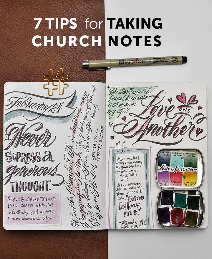
Hanji Notebook: I’m currently using this journal for my Sunday notes. So far it has handled watercolor well, and out of my pens, the Sakura & Pigma pens/markers work best. It’s 5×7 inches without gridlines or ruled lines. Erasing pencil lines is a little tricky here, but as long as I’m gentle, the paper fibers withstand erasing.

Hahnemüle Nostalgie Landscape Notebook: I busted this one out for my recent Yellowstone trip. We sketched and journaled our fun on the trip (Penelope and Junie got really excited about it!). It handled watercolor far better than I imagined. My tombow pens didn’t do so hot on this paper, but my Sakura pens did fabulous here. This paper withstands erasing like a champ. No budging or smudging. It’s 6×8 landscape, but you can find it in a lot of different sizes. 

Golden Coil Notebooks: These notebooks are big. It’s a little less portable than the top two notebooks, BUT…. you can customize how you fill your pages. If you like blank, lined, listed, graph, dot grid, spreadsheet pages you can select them. And you can even do a mixture of all of those with up to 260 pages in each notebook. It’s a great value. I’ve found it works really well with all ink types. It does okay with some watercolor washes with little to no bleed-through. These notebooks are bound on a spiral, making it very easy to write on every page with a flat surface. 

House that Lars Built Notebook: If you’re wanting the color to take care of itself and you just want to focus on form, this pretty notebook from HTLB and Abrams book is gorgeous, with different color background and white dot grid to keep your writing level. Printed paper is ideal for felt tip pens/markers and ball-point pens, but not fountain pens. 

I have some dedicated watercolor journals that I’m waiting to bust out on my trip to Holland next month, so jury’s out on those for the moment. These are by no means all the journals that you can choose from, but the ones that I have and can recommend. 


MY PENCIL CASE: 

I may have a few too many writing instruments in my pencil case… it’s like my security blanket having all my favorite pens with me! I style my journal entries with the supplies I use, so if you ever have a question about something pictured, or how I did a certain letter, feel free to ask me on Instagram. I’m quite responsive on there. :)

Sakura Micron PN: This pen is waterproof & the kids can use this pen without damaging the nib!

Pigma Professional FB, MB & BB: Sometimes I need a different size brush pen to emphasize different things. This set includes the 3 sizes I would need most and best of all, this set is waterproof. 

Pigma Calligrapher 3.0: This chisel nib may not be your jam if you’re not into calligraphy so much, but I really like how I can accentuate and bold words with this broad-edge pen. Also, it’s waterproof. 

Mechanical Pencil: I don’t want to spend my time sharpening a pencil, so I opt for a mechanical pencil with an eraser here. 

Watercolor Pencils: These are great for drafting out things/shapes that I want to watercolor or adding color in small areas that I want to watercolor without having to bust out my watercolor palette. It’s not crucial that these pencils are sharp, so I don’t sharpen them often, but I do have a pencil sharpener hooked to my zipper just in case I need a finer point.

Pocket Watercolors: While you don’t have to spring for handmade watercolors, having a tiny tin of the colors you like most is helpful. I have a bit of a rainbow of a palette here so I can mix just about any color here. I also like Prima and Sakura watercolors for travel. 

Tombow Fude soft & hard: Is it redundant that I have these and the fine Pigma professional? Maybe? But sometimes I want the feel that these nibs give and I don’t need the waterproof aspect. These pens are not waterproof and sometimes bleeds on certain papers. 

Gelly Roll White 10: I like the size 10, it gives you a very opaque white line. I like adding white dots on the downstrokes of my bigger marker work. 

Sharpie Marker: because… sometimes you need to write something permanent on a plastic surface. 

Waterbrush: I like to use a fine-point waterbrush for my sketches because I’m usually only ever doing small washes and I like having that control. 


MY APPROACH: 

It’s not always practical to take the kind of notes that I’ve been posting on Instagram. I’m a mom of 3 and sometimes listening is impossible when I’m wrangling a runaway kid (Felix, I’m looking at you). Since my youngest is 4, my ability to listen in longer uninterrupted chunks is opening up.

I remember when Junie was just born (my youngest), and feeling completely starved at church. I was there, but always missing out on the meat of the meeting. It was frustrating. I was spiritually hangry. If you’re feeling this way and thinking, Who the hell does this girl think she is, encouraging me to write notes at church?  I know It’s not easy and it doesn’t work for everyone. I recognize that I’m in a new stage in life without itty bitty babies so my hands are freed up to write notes. 

That said, here are some tips that will help you get in the flow of things; whether you have kids or not. 

  1. If you have kids (big or small), try to bring a pen/pencil/marker/crayon or two for them. And maybe a notebook that they can pillage. If you’re lacking for paper, let them draw with you. It only makes those layouts all the more precious. This does a few things: it teaches them to respect your desire to write notes and teaches that they can do it too. I’m still learning how to incorporate my kids into journaling without being a demanding art director, but including them has been tender. 
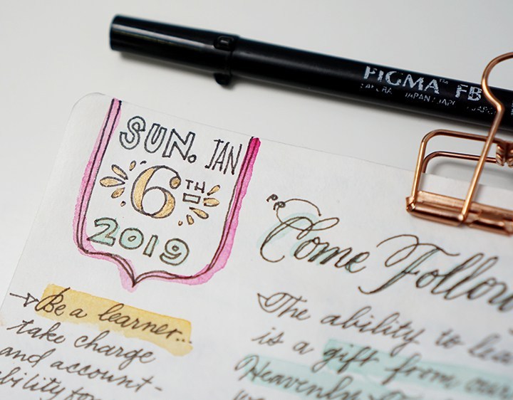
  2. Use singing time and announcements as down time to catch up or mock up your layout. I use that time to write out the date at the beginning of services. This warms me up and gives me some time to get in the mood. Sometimes my dates turn out fancy. Sometimes they’re meh. DON’T GET HUNG UP ON GETTING IT PERFECT. 
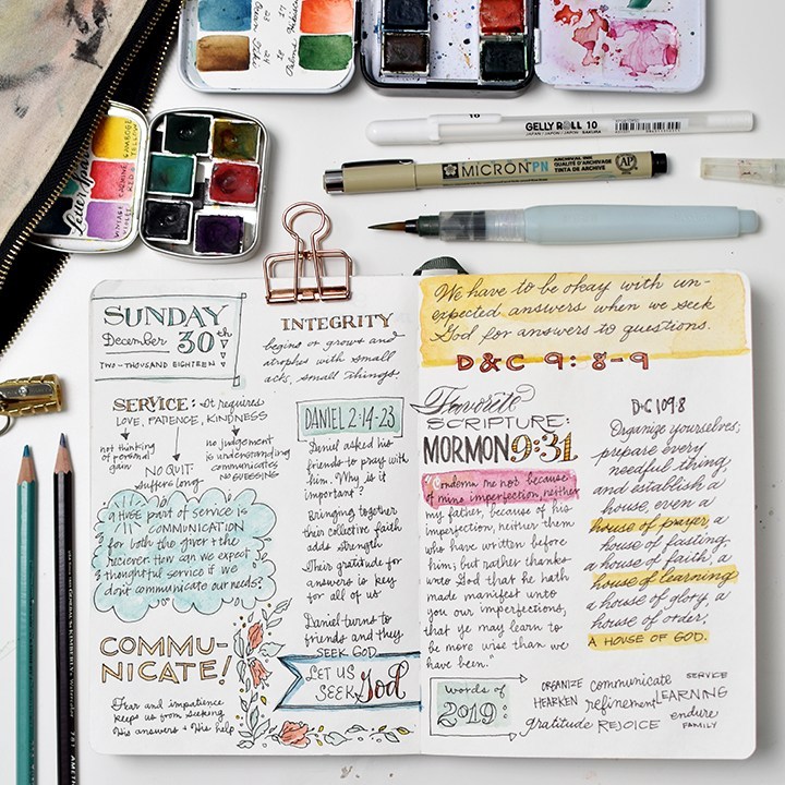
  3. Listen for big-picture themes. Not all talks/sermons are great or easy to follow. Listen for the overarching theme, write your own impressions on the theme and perhaps a scripture/quote/hymn/verse that calls attention to the theme. If the speaker references a hymn or scripture, jot it in pencil in the margins. During downtime or post-church, you can write that in the blank spaces. If you’re listening to General Conference (a semi-annual conference of amazing sermons from leaders of the The Church of Jesus Christ of Latter-Day Saints), listen for these two things: an invitation and a promise. It keeps note taking from getting overwhelming.
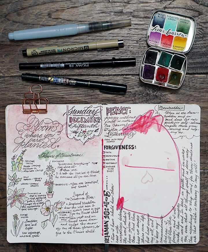
  4. Use columns and shapes to separate ideas, quotes, speakers or soundbites. I generally separate each page into two columns. They’re not always equally divided. But breaking down the space into small chunks helps.
  5. Add a pop of color to emphasize a thought or idea. 
  6. Use this time to play around with handwriting, lettering or calligraphic styles. This is playful time. Just explore. Sometimes your explorations will work and sometimes they won’t. It doesn’t matter if they don’t work out. You tried and you listened. That’s all that really matters. 
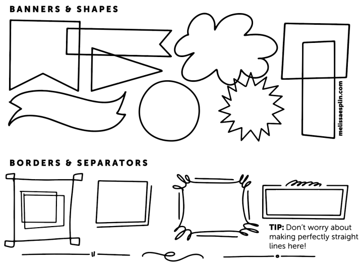
  7. Use decorative designs or illustrations to separate thoughts, quotes, ideas, themes. See below for that printable ideas sheet.

Did you draw up some church notes? Let me know!! I’d love to see how they turned out. 

CLICK HERE TO DOWNLOAD THE IDEAS SHEET

This freebie is available for personal use only. I hope you enjoyed this post and it gets you working on your own journals. Tag me on instagram @melissapher if you end up using these tips. Looking forward to seeing your progress!


Heirloom Journaling Tips with House that Lars Built

0 Comments

I’m over at House that Lars Built sharing some tips on how to fill out an heirloom journal! Click here to read the full article.

Companies like Promptly and Loom are changing the way we’re doing journaling by prompting pointed and focused stories in beautiful and finely-bound books. It’s brilliant. These books are heirlooms meant to be passed down from one generation to the next, the way journaling should be. So no pressure, right? In the era of perfection in social media, it’s easier to not do something than to make it “perfect”. I’m going to let you in on a little secret:  

Truth is, NO ONE CARES. No one cares if I don’t post to this blog each week even though I’m desperate to do it. No one cares if I miss a day posting to Instagram. No one cares about your perfection because everyone is too wrapped up in trying to be perfect themselves. So stop letting your fear of imperfection get in the way of documenting your story. 

When it comes to writing in an heirloom journal, you may be worried about correct spelling and grammar or beautifully funky penmanship. DON’T BE. Get the stories out, write them to the best of your ability. Understand that those who come after you to read what you wrote are either not going to notice your flaws or embrace them and love each one because it’s proof of your living, breathing humanity. You should embrace it, too. 

Bonus tip: When writing in a journal or filling out limited spaces, try to go for a finer point pen than a medium or bold point pen. A medium point pen will, perhaps, make your handwriting look nicer sometimes; but a medium pen is often too large a size point in order to fill out baby stats and what-not. 

Check out all 6 tips over at House that Lars Built!

Photography by Jane Merritt for House that Lars Built

I’m going to share with you a bonus tip: 

Hand-Lettering with Pencils & Upcoming Workshops!

0 Comments

Hey friends!! Welcome here. I’ve got 3 upcoming workshops this summer (more in the works, fingers crossed). I hope to see you there! 

Beginning Brush Lettering Workshop | DRAPER, UT | JULY 19

Learn brush lettering based on more traditional foundations and how to manipulate those foundations to write some funky letters! All skill levels welcome, but it is geared more toward beginners. Lefties welcome!

Eventbrite - July 19 Brush Lettering Calligraphy Workshop

Penmanship Workshop | PROVO, UT | AUGUST 16

Learn the art of beautiful penmanship and how to harness your own style to tell your story. This is perfect for beginners, lefties and future brides! We’ll go through foundations, style and how to address an envelope. 

Eventbrite - Beginning Cursive Penmanship & Letter Writing Night

2-Day Brush Lettering/Digitization Intensive | NASHVILLE, TN | AUG 25-26

Join me in Nashville for a whole lot of fun with a 2-day lettering intensive with the pointed brush. We’ll dig deeper than in any other class in the two days. We’ll go letter-by-letter through variant options, work on word and compositional structure and style structure. At the end of the class, we’ll work on the beginning essentials of digitization by making our own personalized stamps with our artwork. All skill levels welcome. 

Paperinkarts - brush lettering event august 2018

I hope I can see you at one of the above workshops this summer. We always have a blast and I try to pack as much information as possible so you leave the workshop motivated, empowered and ready to continue your calligraphy journey.

Now let’s talk hand-lettering!! Calligraphy and hand-lettering can be intimidating. Especially if you’re just starting out and teaching yourself. That’s where the humble, yet mighty pencil comes in. The pencil’s got your back. In fact, I have my online class students pull out the pencil before they touch any kind of pen or marker. The master penmen use pencils, so you can, too. I’m really excited to have shared this fun and simple technique on KSL’s Studio 5 on how to incorporate pencil lettering into your every day creativity. Let’s do this, shall we?!?

Isn’t this a fun card? You can totally make this in about 10 minutes. 

The cool thing about pencil is that you can erase it until you commit. So watercolor pencils you can erase until you add water. You can erase most pencils quite effectively until you commit by pressing really hard or going overtop in pen. You can see the difference between committing with pressing hard with a dark pencil on the right and a marker on the left. The cool thing is you don’t have to have fancy materials in order to be successful with your pencil lettering. Here’s what you need: 

  • Paper – use a mixed media paper if you’re using watercolor pencil.
  • Ruler – you gotta draw light grid lines or your lettering will be all over the place. Clear grid rulers are my fave.
  • Pencils – I’ve teamed up with General Pencil to create a pencil lettering kit, try it! It’s great.
  • Brush – I like small round brushes for this, but any brush you have on hand could also work!

Step 1: Cut down your paper to size. I’ll leave it up to you as to what size you want to trim it down to. Get a ruler and mark out your top and bottom lines. The master penmen use a ruler to mark out guides, you should too. 

Lightly draft out your message. I find that short words in this style work best. Also, when drafting out your letters, make sure they’re generously spaced apart. Because we’ll be outlining around each letter, you’ll want to make sure you give yourself enough room for those outlines.

Grab a watercolor pencil and roughly mark out the outlines with watercolor pencils. For the sake of this style, pick two colors that you’d like to go together. Use the darker of the two colors for this part of the outline.

Wet a small round brush (this is a size 2 round) and smooth out the outline of your watercolor pencil.

Leave a little bit of white space and outline each letter. I love the General’s draughting pencil for this. It’s hard enough to maintain a stable line, but it’s smooth and dark. 

With your lighter color, outline the right-hand and bottom sides of your outline. You’ll use a light touch to lay down pigment to not disrupt the draughting pencil layer. 

Using the same wet round brush, smooth out and soften the drop shadow you’ve created. 

Once the watercolor is dry, erase away guidelines carefully. I like to use the corner of the eraser. 

Bam! You’re done. You can send it as-is, or you can trace over the darker pencil marks in pen or marker to make the layout pop even more.

This tutorial is free for personal use. Affiliates are used to link to products I actually use and have. Your support here makes more content possible. Thank you!

How to Paint Ranunculus Watercolor

2 Comments

Another YouTube video coming at you this week! It’s taken me forever to get this post out, the end of school stuff just took so much out of my week last week. So here we are posting late. If you want to stay up-to-date on new videos, subscribe over on YouTube! I’d love to see you over there. You can expect to see product reviews, art tutorials and time-lapse/real-time calligraphy work. 

I’m giving you a peek into my process with my 100 days project (follow along here!). It’s a fun but crazy challenge to attack so many of these flowers. And ultimately I’ve come to grips with the fact that I won’t be able to finish them all in 100 days. I’m so far behind. But I’m determined to see this series through, no matter how long it takes!! Here’s what you’ll need (these are the exact materials I used): 

HEY!! Use code Melissa15% at myprimaplace.com for 15% off your order. I tried the Prima Watercolor Confections for the first time with this flower set and I’m loving how the colors blend, lay down, dry and mix. They’re just lovely. And aren’t these little tins just the cutest things ever?!? 

Here are the steps broken down. But I HIGHLY recommend watching the video. I give far more detail in the video. To do: 

  • Start by using your largest brush and mix a light yellow green, bright yellow, and yellow orange. You’ll want all three colors mixed before you start. 
  • Lay down brush marks in a circle with the light yellow green. As you make a larger circle (keep it uneven), start picking up the yellows, then as you get to the outside of the flower, move on to the yellow orange. 
  • Allow the colors to melt into each other creating a subtle gradation from green to yellow to orange. 
  • Let your flower dry fully
  • Next, use the size 6 brush and a darker version of your orange to create smaller concentric circles around, creating the shadows. 
  • While you’re waiting for the flower to dry, add the foliage. Work and frame your flower by branching the foliage back into the flower. 
  • Now get the liner brush with the same color, or just slightly darker (not by much) and add the details to the petals and darken up the concentric lines and the greenery in the middle. 
  • Add any other decorative bits and you’re done!


Try changing up your perspective for a full bouquet of ranunculus! I hope you give this tutorial a try. I’d love to see your work if you do! Tag me (@melissapher) on Instagram or message me here if you end up trying this technique out!

This tutorial is free for personal use. Affiliate links are used to products I actually use and have. Your support here makes more content possible. Thank you!

mobile site