Posts Tagged ‘wedding’

Calligraphy: Handmade Wedding Invitations

0 Comments

Check it out! I made it on Oh So Beautiful Paper!

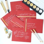
Stretching my limitations and challenging my capacity is one way to describe this wedding suite. I usually calligraph and PRINT wedding invitations. This one was all hand calligraphed.

melissaesplin-hand-written-original-wedding-invitation-1

About the bride: Lynsey is an UBER classy girl from our neighborhood. Her and her sister run Alder & Tweed an interior design firm based out of Park City, Utah. And when I say classy, I mean basically every outfit is sartorial street-style straight out of Manhattan.

melissaesplin-hand-written-original-wedding-invitation-2

She’s my dream client. However, I only had 14 days to complete the invitations before the wedding. This means I had about 2-4 days tops to complete invitations and envelopes so guests could get their invitations! Most of the invitations were delivered by hand, so mailing wasn’t too much of an issue. There were a couple of invitations that were mailed outside of Utah, which made me nervous, but because it was such an intimate event every guest had the date saved.

melissaesplin-hand-written-original-wedding-invitation-5

The invitations themselves were classic. I worked on flourishing the names and did a slightly flourished running script for the main text. I hesitate to call this real Spencerian, because it’s fairly casual and doesn’t have the classic Spencerian shades. I opted out of that for the text because of the paper. The felt-finish paper caused some issues with keeping fine, smooth hairlines. Overall, I feel like it worked because of the rustic venue for the event.

For the finest hairlines, I used a Nikko G nib (it works best on those rough papers) and Old World iron gall ink. The Iron Gall ate about 3 of my nibs through the course of the 30 invitations and envelopes, but it was worth it.

melissaesplin-hand-written-original-wedding-invitation-3

melissaesplin-hand-written-original-wedding-invitation-4

melissaesplin-hand-written-original-wedding-invitation-6

The lightbox was my BFF for this project. I created the design on layout paper, drew in the text with a dark micron pen and taped it onto the light box. I used light adhesive washi tape to tape each paper in place while I lettered. It took about 8 1/2 minutes for me to write out each invitation.

melissaesplin-hand-written-original-wedding-invitation-7

The bride and family were over-the-moon to see their names ornately flourished. I really had fun with the addresses. I got in a groove and just flourished these names to bits!

melissaesplin-hand-written-original-wedding-invitation-8

The wedding was stunning. See snippets here and here. And here.

Want to learn calligraphy? Take my online class! Learn with videos, images, text and personal coaching (like real comments from real professionals). Purchase the pointed pen kit right here.

learn-calligraphy-pen

Design: Emily and Taylor Wedding

0 Comments

My sister got remarried! I’m so excited for her. As a gift to them, I designed their wedding invitations. She was the easiest to please bride I’ve ever worked with. All she wanted was something casual, but nice. I decided to go with some brush work with the design.

melissaesplin-emily-and-taylor-wedding-watercolor-invitation-calligraphy-1

I used a more formal brush hand, but kept it in the casual zone by varying the letter sizing just a touch and pairing it with a simple sans serif. My favorite sans serif at the moment: Museo Sans 300. I swear I use this for everything. It’s like the denim jeans of fonts for me. It’s more round than Helvetica Neue, so a tad more casual, but so classic.

I created and scanned in a teal watercolor wash. I used Daniel Smith Cobalt Teal Blue and Daniel Smith Phalo Turquoise for the gorgeous colored washes. They’re incredible watercolors!

melissaesplin-emily-and-taylor-wedding-watercolor-invitation-calligraphy-2

Em wanted them really simple, but I felt like they were too plain as-is. Since she was only doing a few dozen, I bought some white vellum and cut out overlays with a heart goign around their names. It’s really hard to photograph, but if you look closely you can see.

I didn’t cut them by hand. I used the design as a reference to create the heart-shaped overlay in Illustrator then I cut using my Silhouette.

melissaesplin-emily-and-taylor-wedding-watercolor-invitation-calligraphy-3

melissaesplin-emily-and-taylor-wedding-watercolor-invitation-calligraphy-4

I bought teal envelopes to coordinate with the watercolor washes and addressed the envelopes in a more formal brush for the names and a casual print for the addresses.

saltybooth-tay-and-em

Pic c/o SaltyBooth

I love how this mini wedding suite turned out, but most of all I’m glad to see my sister found a great guy.


Calligraphy: Eric & Margaret’s Invitations

5 Comments

Our family just expanded! My brother-in-law Eric got hitched last month to a really awesome gal. We’re so thrilled to add her to the family.

melissaesplin-calligraphy-design-margaret-eric-wedding-1

Since Eric and Margaret live pretty close to us (for about a year Eric lived with us), we’ve been able to get to know Margaret really well. But for some reason, I was coming up blank when it came to the design of the invitation. I think I started 3 different designs. None of them felt quite right. Too masculine, too formal, too boring.

melissaesplin-calligraphy-design-margaret-eric-wedding-2

The other limitation was the size. We went with an A2 envelope, which left us with basically a quarter sheet. With only that much space, I had to be creative to get information for both receptions on there without looking cramped or tiny. With relying on the personality of the type and going for a simple layout, I was able to make this happen.

In this case, bride and groom had varying amount of letters in their first and middle names. This made balancing out left to right a little complicated, but the extra flourishes to the right of ‘Eric’ did the job.

melissaesplin-calligraphy-design-margaret-eric-wedding-3

The colors were greens and bright yellows, which are perfect summer colors, but can get a little overwhelming if you have large fields of those colors. We opted for a bright white stock and green print with little details of yellow in the printing and with washi tape.

melissaesplin-calligraphy-design-margaret-eric-wedding-4

The design and assembly of the invitation was simple, but special. I’m thrilled how it all turned out. I’m also thrilled that they got hitched, too. :)

Calligraphy: Whitney’s Wedding Invitations

7 Comments

Unique wedding invitations are just about the best possible gift I feel I can give to a family member about to get married. It’s not something that I like to do for clients that often, but I love designing them for family members.

istillloveyou-melissaesplin-calligraphy-whitney-wedding-invitations-1

I guess you could say it’s another hobby of mine, even though it’s very much related to my business of teaching calligraphy to others. I love it so much.

istillloveyou-melissaesplin-calligraphy-whitney-wedding-invitations-2

My cousin Whitney is a very classic girl with a modern twist. I knew she and her mom would have very timeless decor at the wedding with simple elegance, so I conveyed that in a nearly all-calligraphed invitation.

istillloveyou-melissaesplin-calligraphy-whitney-wedding-invitations-3

The twist? Printing the names instead of lettering them. It sounds like a gimmick when I write it out like this, but it helps break up the blocks of calligraphy without making the invitation appear busy.

istillloveyou-melissaesplin-calligraphy-whitney-wedding-invitations-4

The ceremony invitations were done mostly in text with special little flourishes here and there.

It’s hard to tell from the photos, but the invitation paper is off-white and the printed text is a dark olive green. A slight variation on the traditional black and white invitation.

istillloveyou-melissaesplin-calligraphy-whitney-wedding-invitations-5

I didn’t know a whole lot about how the reception was going to go, but it turns out the invitations set the tone for the celebration perfectly. The venue was an old 1800s meeting hall with cream walls, white 10″+ moulding, original hardwood floors and stone masonry construction. The party was decorated wall to wall with garlands of doilies and large center-pieces of baby’s breath. Simple, yet oh-so-elegant.

Inspirational Calligraphy: Gold Glam

2 Comments

I had the pleasure to contribute some calligraphy for a photoshoot a couple weeks ago. The theme: Gold, the style: Hollywood Glam.

istillloveyou-calligraphy-goldinspiration-1

I went for a flourished style with more traditional notes. But little nods to contemporary styling with the angled baseline

I just went for it, not knowing the overall look of the shoot. I’m stoked at how well it all fit together.

istillloveyou-calligraphy-goldinspiration-2

istillloveyou-calligraphy-goldinspiration-4

For the boutonnière cards, I went lowercase and simple, with a little flourish.

istillloveyou-calligraphy-goldinspiration-5

For the place cards I went more traditional and fancypants with lots of flourishes with each name.

istillloveyou-calligraphy-goldinspiration-6

Learn how to use the pointed pen with my online calligraphy class at I Still Love Calligraphy.

TFDS: bride & groom stylized shoot from Jesse & Kimberly Moore on Vimeo.

View the video above to see more.

Credits:

mobile site