Posts Tagged ‘watercolor’

Sakura CAC Neons & Metallics Review

0 Comments

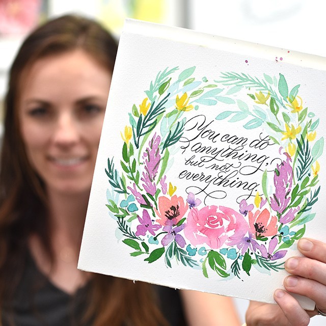
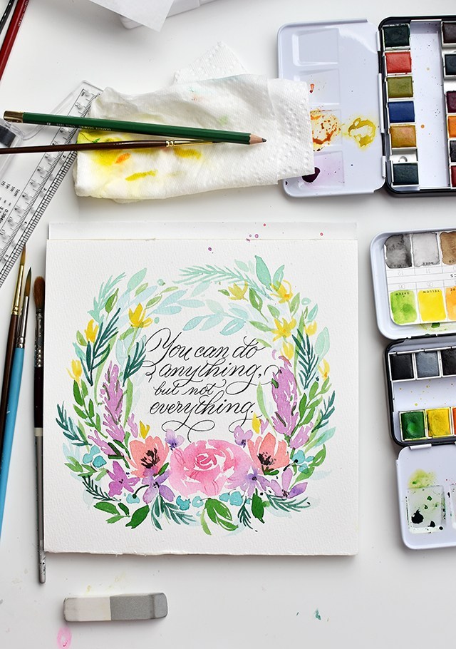
Hey friends!! Welcome here. I’ve got 3 upcoming workshops this summer (more in the works, fingers crossed). I hope to see you there!

Beginning Brush Lettering Workshop | DRAPER, UT | JULY 19

Learn brush lettering based on more traditional foundations and how to manipulate those foundations to write some funky letters! All skill levels welcome, but it is geared more toward beginners. Lefties welcome!

Eventbrite - July 19 Brush Lettering Calligraphy Workshop


Penmanship Workshop | PROVO, UT | AUGUST 16

Learn the art of beautiful penmanship and how to harness your own style to tell your story. This is perfect for beginners, lefties and future brides! We’ll go through foundations, style and how to address an envelope. 

Eventbrite - Beginning Cursive Penmanship & Letter Writing Night


2-Day Brush Lettering/Digitization Intensive | NASHVILLE, TN | AUG 25-26

Join me in Nashville for a whole lot of fun with a 2-day lettering intensive with the pointed brush. We’ll dig deeper than in any other class in the two days. We’ll go letter-by-letter through variant options, work on word and compositional structure and style structure. At the end of the class, we’ll work on the beginning essentials of digitization by making our own personalized stamps with our artwork. All skill levels welcome. 

Paperinkarts - brush lettering event august 2018

I hope I can see you at one of the above workshops this summer. We always have a blast and I try to pack as much information as possible so you leave the workshop motivated, empowered and ready to continue your calligraphy journey.

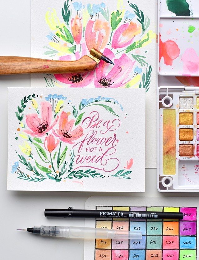
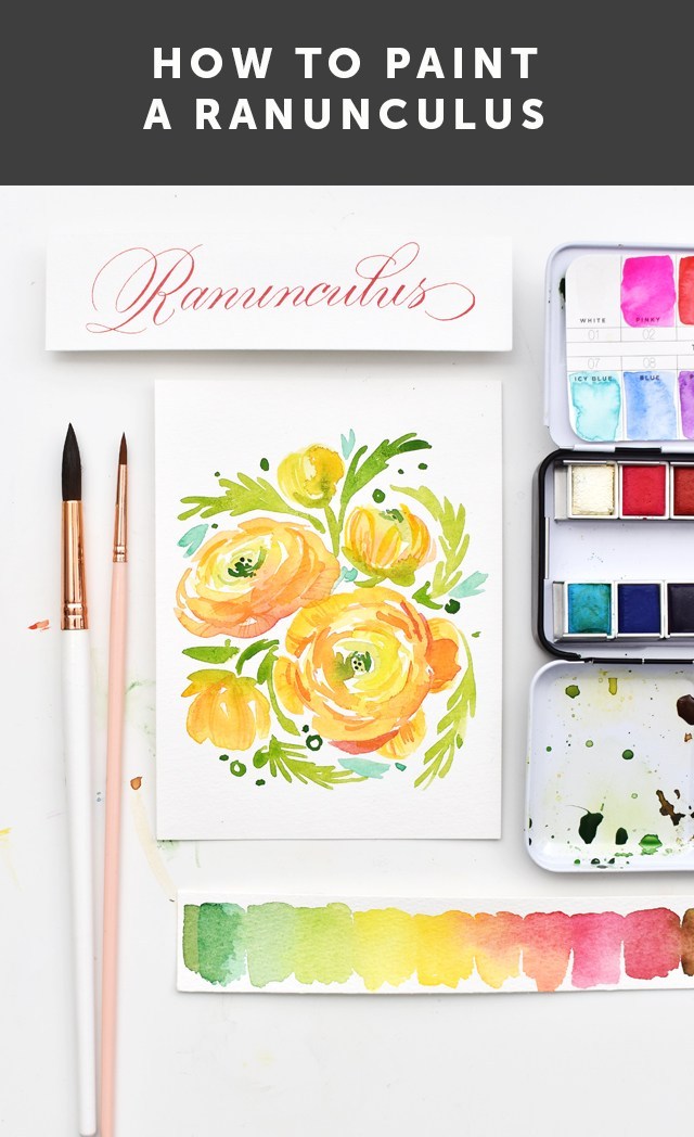
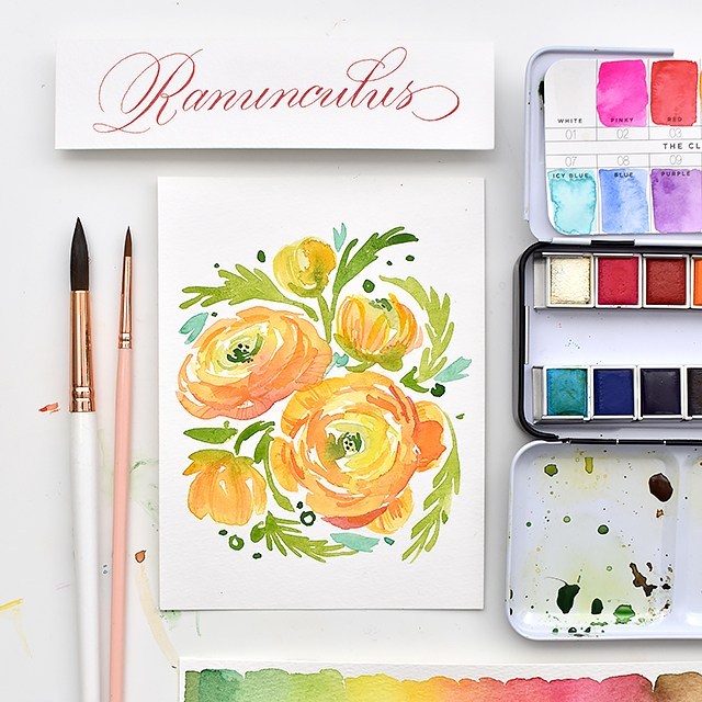
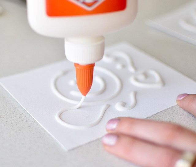
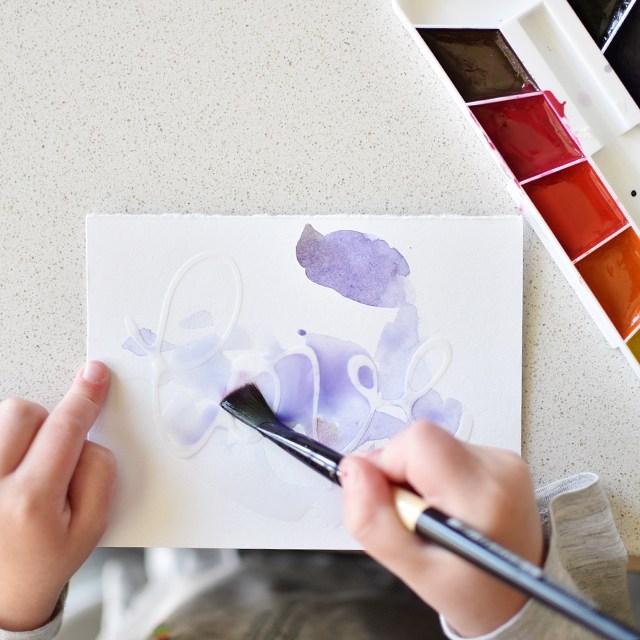
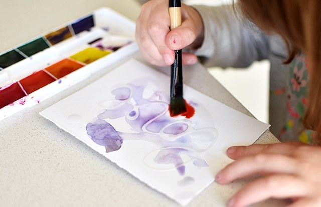
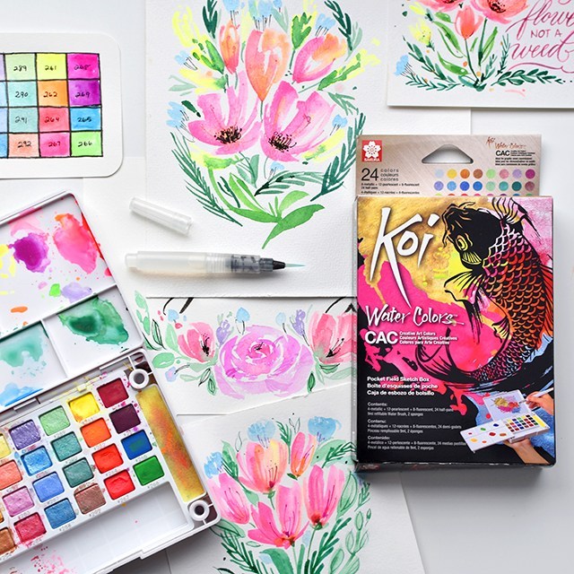
Sakura sent me their BRAND-NEW CAC (Creative Art Colors) 24 pan watercolor set to play around with. It’s just like their regular 24 pan field sketch set, but with nothing but neons, metallics and pearlescent colors. Uhhhhhhmmmmmmm yes please! I love how bright these pigments are and it’s a real pity that they’re not captured fully with these photos. The colors just JUMP off the page. So I made a review video (above). Give it a watch or you can scroll down below to see the pros and cons list:

Pros:

  • SUUUPER bright pigments
  • Smooth blending (even with regular colors)
  • Zero chalkiness
  • Portable size palette
  • Generous wells for mixing pigments
  • Shimmery pearlescents

Cons:

  • Student grade
  • Not lightfast
  • Metallics not opaque

I feel like I need to give explanation to the cons. It’s a bummer they’re student grade and not artist or professional grade, but they out-perform any student grade pigments I have in my studio as if they were artist grade. So bummer, but not a deal breaker.

The neons especially aren’t lightfast at all. But you’re not going to find light-fast neons anyway. Just be aware that they’re not lightfast so you’re not displaying your work where it gets direct sunlight.

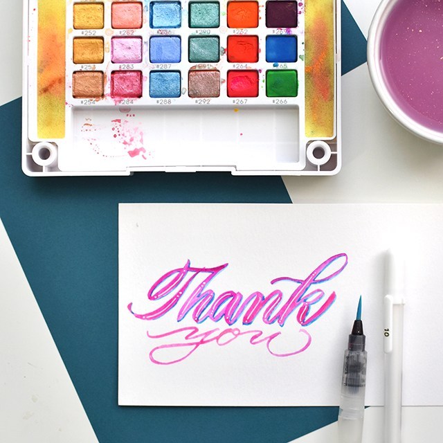
I personally like more opaque metallics. Don’t get me wrong, these metallics are beautiful, but if you’re going to try and do fine linework like use the pointed pen with the metallics, you’re not going to get the opacity you need to get the metallic to jump off the page. You’ll want to switch over to the pearlescent pigments for pointed pen linework. The pearlescents have watercolor pigment and metallic in them so the pigment soaks into the page while the metallic shimmers at the top of the page. It’s lovely.

Overall: I really love these watercolors! They’re really great! I hope you give them a try some time.

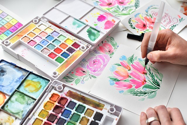
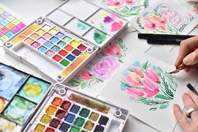
I’ve been using the medium waterbrush that came with the kit, but then also adding in fun details with the Gillott 404 to bring in those finer details. It’s a lot of fun to bridge the gap of brush lettering and pointed pen modern calligraphy with this neon set. Overall, I’m a fan. 

Sakura of America provided me with the materials for this review. All opinions are my own. Affiliate links are used, your support by purchasing through these links supports more content like this! 

Calligraphy & Watercolor Motivational Quote Time-Lapse Process Video

4 Comments

I painted one thing this week. But I’m pretty darn happy with it, so I thought I would share here. 

Tools Used:

*Use code  Melissa15% for 15% off your purchase at myprimaplace.com!

This quote has been rolling around in my head all week. I’m thinking of doing a mental/physical inventory of my life and let go of the things that I don’t need to hold on to. I don’t need to hold onto the idea of making a line of women’s swimsuits, or writing a hymn, or learning how to cobble shoes. I can let go of all of those things. So this is just a reminder of that. I plan on framing it sometime soon and hanging it in my studio as a reminder to stay focused and to really dive deep into what it is I want to do with my life. Like seriously, I got asked this week what I wanted to do and I was like… uhhhhh……

I should probably figure out what my end goal is here so I can actually run towards it. 

So click play on the video above if you want to hear more about the materials I used, why, what was going on in my head at the time of illustrating it out. I want to let you know, Natalie Malan was a huge inspiration (her classes are the best) for the style of florals for this piece. 

And if you want to learn brush lettering, I’m teaching a local workshop in utah. REGISTRATION IS HERE. And there’s always my online class which includes personal coaching, right here.

Affiliate links are used, your purchases support additional videos on this channel. Thank you!

How to Paint Ranunculus Watercolor

2 Comments

Another YouTube video coming at you this week! It’s taken me forever to get this post out, the end of school stuff just took so much out of my week last week. So here we are posting late. If you want to stay up-to-date on new videos, subscribe over on YouTube! I’d love to see you over there. You can expect to see product reviews, art tutorials and time-lapse/real-time calligraphy work. 

I’m giving you a peek into my process with my 100 days project (follow along here!). It’s a fun but crazy challenge to attack so many of these flowers. And ultimately I’ve come to grips with the fact that I won’t be able to finish them all in 100 days. I’m so far behind. But I’m determined to see this series through, no matter how long it takes!! Here’s what you’ll need (these are the exact materials I used): 

HEY!! Use code Melissa15% at myprimaplace.com for 15% off your order. I tried the Prima Watercolor Confections for the first time with this flower set and I’m loving how the colors blend, lay down, dry and mix. They’re just lovely. And aren’t these little tins just the cutest things ever?!? 

Here are the steps broken down. But I HIGHLY recommend watching the video. I give far more detail in the video. To do: 

  • Start by using your largest brush and mix a light yellow green, bright yellow, and yellow orange. You’ll want all three colors mixed before you start. 
  • Lay down brush marks in a circle with the light yellow green. As you make a larger circle (keep it uneven), start picking up the yellows, then as you get to the outside of the flower, move on to the yellow orange. 
  • Allow the colors to melt into each other creating a subtle gradation from green to yellow to orange. 
  • Let your flower dry fully
  • Next, use the size 6 brush and a darker version of your orange to create smaller concentric circles around, creating the shadows. 
  • While you’re waiting for the flower to dry, add the foliage. Work and frame your flower by branching the foliage back into the flower. 
  • Now get the liner brush with the same color, or just slightly darker (not by much) and add the details to the petals and darken up the concentric lines and the greenery in the middle. 
  • Add any other decorative bits and you’re done!


Try changing up your perspective for a full bouquet of ranunculus! I hope you give this tutorial a try. I’d love to see your work if you do! Tag me (@melissapher) on Instagram or message me here if you end up trying this technique out!

This tutorial is free for personal use. Affiliate links are used to products I actually use and have. Your support here makes more content possible. Thank you!

Watercolor Pencil Ranunculus Tutorial

0 Comments

I’ve had this thing in the queue too long! It’s no secret that I’m a materials hoarder. When I got the chance to score a set of General’s Kimberly Watercolor Pencils, I jumped at the chance. I tried watercolor pencils a long, long time ago (before I really even knew a thing about watercolor painting in general), and didn’t really do well with them. I needed to make up for lost time. 

I really loved how these watercolor pencils turned out. They’re smooth, vibrant, juicy, and blendable. BUT… they aren’t watercolor paints! There’s a real distinction between the two… See? 

I love how I can get very gestural strokes with the watercolor pencils. It adds a lot of movement to the paper. I filmed a quick little tutorial on how to make your own ranunculus in the video below. I do hope you enjoy! 


Add your own calligraphy to your florals, and you’ve got a VA-VA-VOOM piece that your friends and family will love! Don’t know calligraphy yet? Consider taking my online class. It’s THE BEST (if I do say so myself. ;)). 

DIY: Raised Lettering With Glue

0 Comments

I was on local TV show, Studio 5 this week sharing a fun how-to with Elmer’s glue: Raised lettering. It’s really quite addicting and something you can rope your kids into (perfect for a Father’s Day craft). It doesn’t have to be lettering you include on the card, either. Abstract designs really add a lot of depth, too. So any age and skill level could do this craft. But be careful, it could get messy. ;) Here’s the link to the segment if you’d like to take a look!

So here’s what you need: 

Figure out your design. I found the simpler the better. The largest word I was successfully able to write without bleeding and readability issues was “love”. “Hi”, “Hey”, “thx” totally worked. 

Keep your glue bottle about an inch to two inches away. Allowing the steady stream of glue to create smooth curves. Set out in the sun for a couple of hours to dry. I use little porcelain dominoes to keep them from flying away. 

Once the cards are dry, paint overtop! This is super fun because the paint job can be whatever. So include your little ones and do something fun. This is a great way to get them involved in hand-written ‘Thank You’s and perfect for Father’s Day this upcoming weekend. 

Junie got really excited about this project, too. We had a great time disconnecting from screens and making some fun artwork. 

Hope you get around to doing some fun raised cards soon! Feel free to comment below if you did the project. I’d love to see how they turned out. 

This tutorial is free for personal use. Link with love. Thanks! Affiliate links are used.  

mobile site