If you’re here from KSL Studio 5, WELCOME!! I’m excited to have you here! If you’d like to join my next calligraphy workshop in Salt Lake City, click here to register. If you’d like to learn calligraphy online, click here instead. ;)
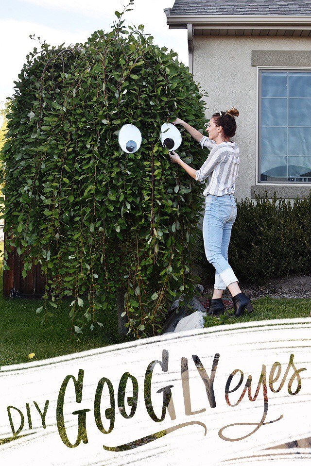
This DIY is too simple and hilarious not to share. Last year I bought some 7″ googly eyes from amazon and hung them on my willow tree in the front yard. It rained. The googly eyes fell apart. $7 down the drain. I think those googly eyes would have been great if I had used them inside, or if I lived in a climate that never rained or snowed during the month of October. :/ BUT this year I decided I needed to keep with the googly eye tradition and just make my own.
And honestly, I don’t know why I didn’t make a million of these bad boys before. They’re easy and cost basically nothing. I had everything on-hand because, well… I’m a craft supplies hoarder. I didn’t have black cardstock, but I did have black lined writing paper, so I used that. You can cut out your own by hand or on a craft cutter like the Silhouette (which is what I did) OR you can print out the eyeballs from the template I’ve designed by clicking the download link below:
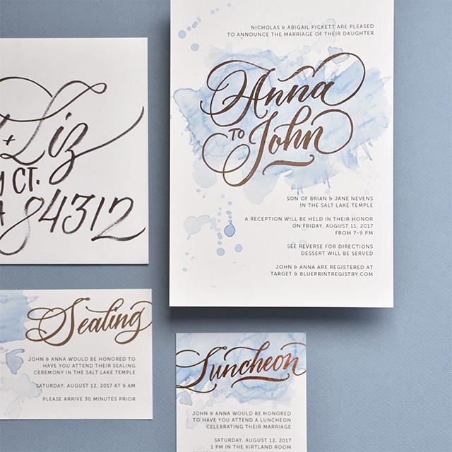
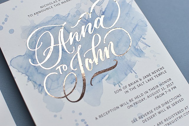
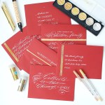
I had the joy to design and letter the wedding invitations for one of my cousins this last August. They were dream clients, too. Both have amazing taste and trusted my expertise and let me play with some fun, new techniques.
I’ve really enjoyed playing around with watercolor pencils and the playfulness and depth they provide to a simple watercolor wash, so I mixed a few colors to get their wedding colors in the wash and went to town. See the below video for an in-depth explanation of how to get that wash. I love the energy that explodes from the background with those washes.
Check out the tutorial below and subscribe to my YouTube channel for more tutorials like this in the future!
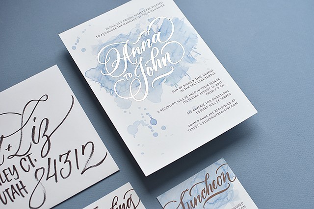
We went with copper foil printing for the names on the invitation. Part of me wanted to do copper foil for all of the text, but I didn’t want readability to be an issue. We did digital printing with digital foil through a wholesale printer I have an account with, so it was quite affordable, too!
Man, foil is so hard to capture with a camera! It has a lovely rosy, rusty tone to it, it’s hard to see that in the images. But it popped nicely against the watercolor background.
For the design, I used my go-to font Museo Sans and my own hand-lettering. I lettered the names and titles of cards with my iPad Pro using Procreate and Brush #4 from Fabian Fischer’s ultimate calligraphy brush set. I really liked the texture and functionality of that brush more than any other brush I’ve found around. If you’ve found other good ones, let me know!
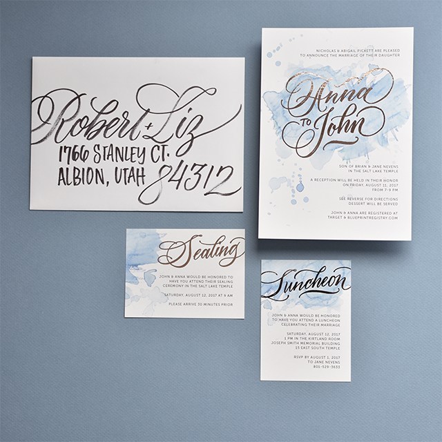
I ended up addressing all of the envelopes for the invitations as well. The couple gave me 100% creative freedom to pen them however worked best. I ended up doing a large-scale script for the names with an all caps for the address. I used the Cocoiro Brush Type marker (if you’re purchasing one for the first time, don’t forget to get a pen body to go with it). The markers lasted me about 75 invitations before it ran out of ink. I ended up doing between 500-600 envelopes. It was a project for sure, but I was THRILLED with the end result.
I’ve recreated the invitations using my ink-jet printer and laser printer and foil laminator so you can see some of the spots where the foil didn’t adhere. All details have been changed for privacy purposes.
Iron provided by CHI® and BedBath & Beyond. Whether taking the wrinkles out of a new bedspread or curtains as the finishing touch on a home décor project, ironing your favorite outfit for a special occasion or flattening paper for artwork the CHI® Electronic Retractable Clothing Iron is the bee’s knees.
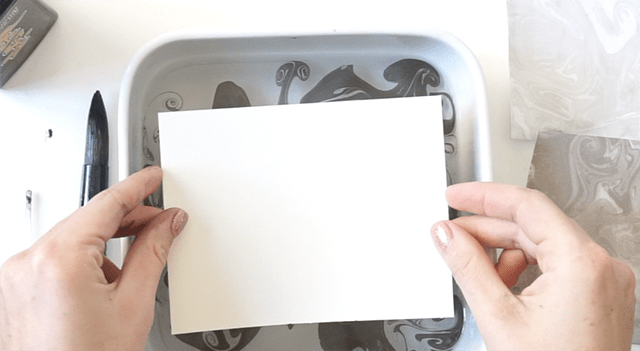
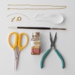
SUMINIGASHI!! This marbling technique is so super awesome. It’s one of those projects that doesn’t really require a whole lot of space or preparation. I had everything on-hand for this project, so there was little barrier to entry here.
HOWEVER, there was a little bit of a learning curve. Check out this little video Hayley and I made about our discoveries through trouble-shooting (the tutorial is at the end if you want to skip to the end there, too).
In a nutshell, here’s what we found:
Cold water works best
You can use soap to help disperse the ink, but you need a large water bath in order to keep the ink from dropping from the surface
Use only sumi ink if you plan on using a smaller water bath (we used a kitchen dish for note cards and envelopes)
Not all sumi inks work well. Of the sumi inks I have, Yasutomo worked the best
If you’re doing this project with little people, you may want to add aprons, rubber gloves and a drop cloth to the mix (especially if you’re doing larger ink baths).
Fill your container with cold water. I chose to use a small container for the video, but I’m on Studio 5 on Tuesday sharing how you can do it with soap and a larger container. So either can be done.
Get your ink brush wet and load it up with sumi ink. Barely tap the surface of the water and watch the water disperse along the surface.
Add more dots along the surface, spacing them randomly apart. the longer your brush touches the surface, the larger the dot.
Get as many dots as you want, until you feel happy with the blank space to ink ratio.
With a toothpick or eye dropper, drag the tool along the surface to pull and move the ink around. You’ll get little swirls all over.
Grab your paper and submerse the first paper entirely.
Pull your print and place on a cookie sheet to dry. If you’re doing envelopes, touch only the surface of the water to the front of the envelope. Hold the envelope by the flap so it doesn’t get wet (otherwise it will seal shut as it dries).
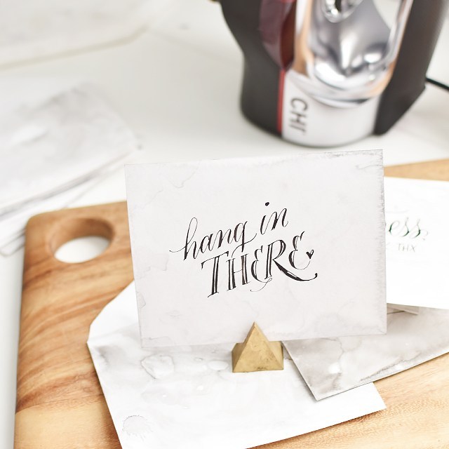
Now what do you do when the paper dries?? It’s so annoying when papers dry all curly and whatnot. And they will. So iron them! A huge shout out to CHI Heat tools and Bed Bath and Beyond for providing me with a brand-new iron for my sewing and paper crafting.
I’ve been a Rowenta gal for a long time, but it wasn’t hard to make the switch. It’s light-weight, yet substantial, the plate is silky smooth, the heat time is short, the reservoir for steaming is twice the size of my old one and it has a retractable cord. All wins in my book. If you’re in the market for a new iron, this is it.
For ironing paper, get a cutting board (something smooth, yet will take heat) and a piece of quilting cotton. Set the iron to COTTON with NO STEAM. Place the cotton over the paper you’re about to iron and press for 15-20 seconds, moving the iron as you go. Flip the paper around and repeat. The paper may want to curl in the direction of its grain, but it will relax once it cools back down.
Pretty fun, right? I would recommend doing this in batches to save time. The print or write your desired phrases overtop!
This post is sponsored by CHI® and Bed Bath & Beyond. All opinions are my own.
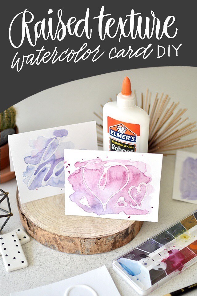
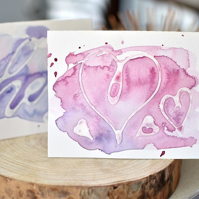
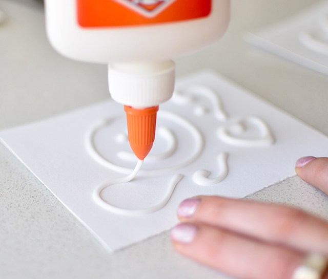
I was on local TV show, Studio 5 this week sharing a fun how-to with Elmer’s glue: Raised lettering. It’s really quite addicting and something you can rope your kids into (perfect for a Father’s Day craft). It doesn’t have to be lettering you include on the card, either. Abstract designs really add a lot of depth, too. So any age and skill level could do this craft. But be careful, it could get messy. ;) Here’s the link to the segment if you’d like to take a look!
Figure out your design. I found the simpler the better. The largest word I was successfully able to write without bleeding and readability issues was “love”. “Hi”, “Hey”, “thx” totally worked.
Keep your glue bottle about an inch to two inches away. Allowing the steady stream of glue to create smooth curves. Set out in the sun for a couple of hours to dry. I use little porcelain dominoes to keep them from flying away.
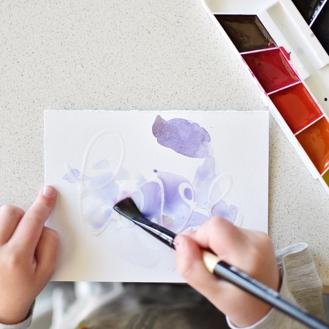
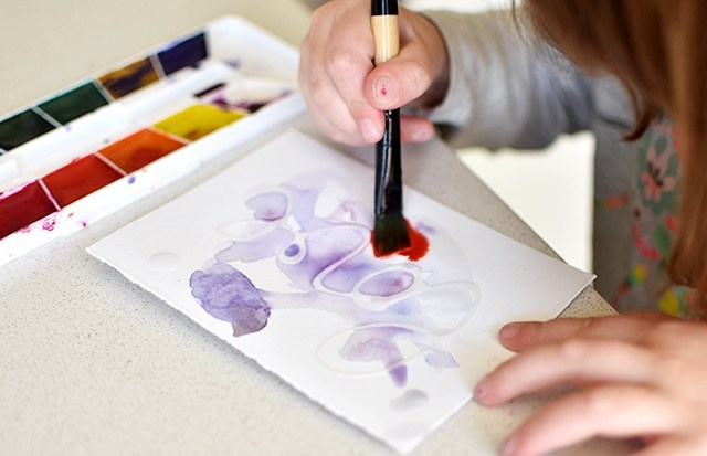
Once the cards are dry, paint overtop! This is super fun because the paint job can be whatever. So include your little ones and do something fun. This is a great way to get them involved in hand-written ‘Thank You’s and perfect for Father’s Day this upcoming weekend.
Junie got really excited about this project, too. We had a great time disconnecting from screens and making some fun artwork.
Hope you get around to doing some fun raised cards soon! Feel free to comment below if you did the project. I’d love to see how they turned out.
This tutorial is free for personal use. Link with love. Thanks! Affiliate links are used.
This post is in partnership with Therm O Web’s Deco Foil™ line. I’ve been using this stuff for a couple of months now and I figured it was high time I shared with you how I use it! It’s incredibly easy and adds SO MUCH SPARKLE to your work (calligraphy or otherwise).
In the above image I’ve applied the metallic foil (I don’t dare say gold, because it’s not real gold) in 3 different ways; (from top) laminator, bone folder and die cut machine. My favorite is probably the die cut machine, second is the bone folder because of the application. But I’ll talk about that a little later.
The foils come in a zillion different colors. I’m excited to try the watercolor foils soon because of the subtle color variation from one spot to another. Here I’ve used Pink Melon (top), Rose Gold (middle) and Copper (bottom). I use the copper one the most, it photographs better than the lighter golds do, so I prefer that. Let’s go through the materials needed for this technique and just get going, shall we?
The supplies list feels kind of long to me; but I bet if you’re anything like me, you’ll have most of these things. For the instructions, click the read more button below!